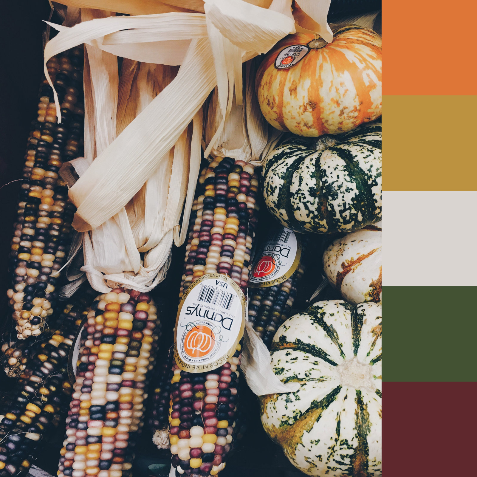
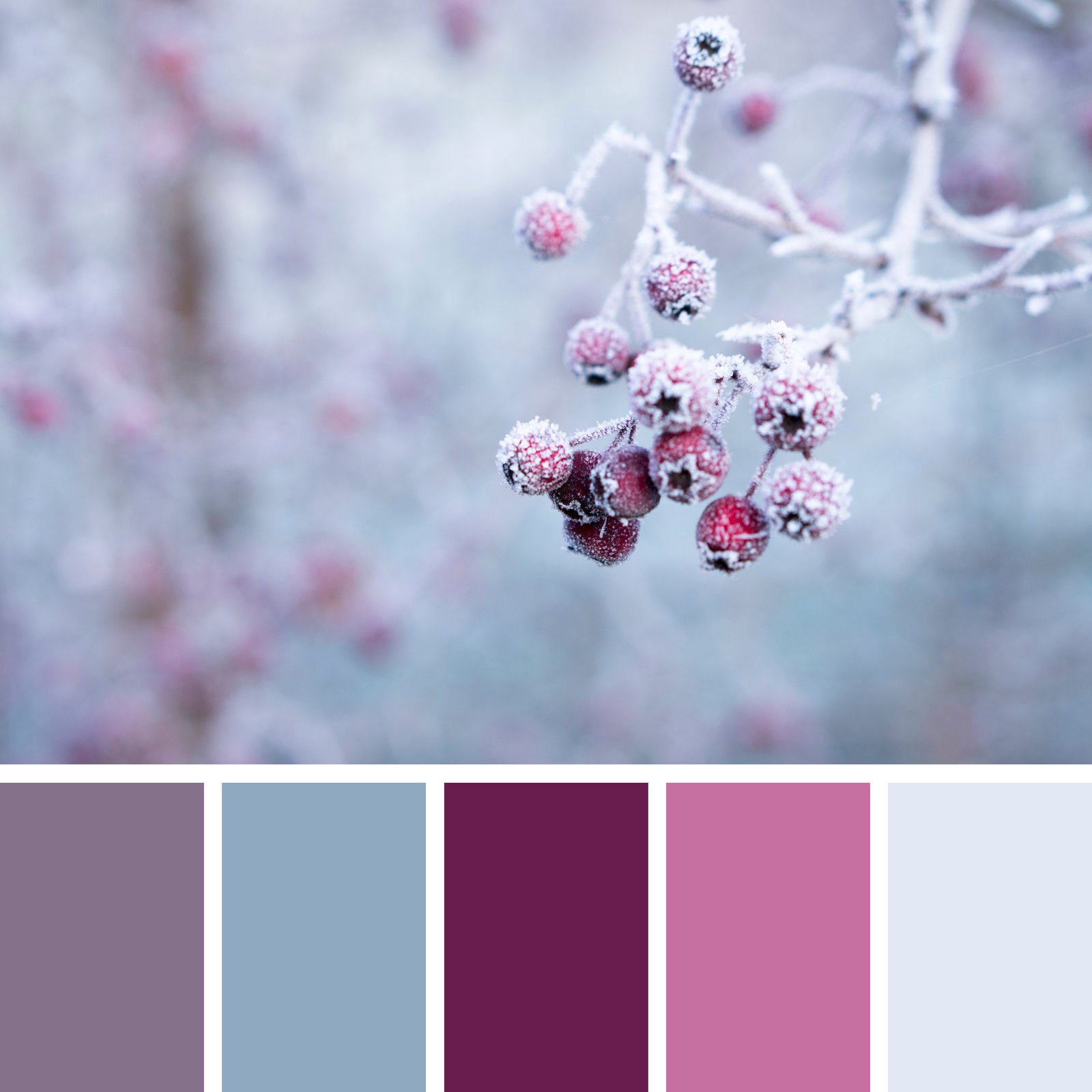

Your color choices can set the mood for your message.
Although professional artists may for years study the depths of color theory, nearly everyone can easily recognize the impact that color has on our perception of the world around us. We decorate our baby's nursery in delicate pastels while the toddlers may go for brighter primary hues. Our places of rest and relaxation are more likely to be adorned with subdued blue and gray tones. Celebrations call for colors that POP!
Colors have cultural connections as well. I immediately think of my beautiful friend from the Carribean who always looks stunning in bright, richly saturated hues of citrus yellows and oranges - in contrast to my New England attire of navy blue, burgundy, black and gray. (I do wear a colorful scarf on occasion!) In Western culture, white is a symbol of purity, innocence, hope. In some Eastern cultures, white symbolizes death.
Our color choices may be very personal, but research has shown that color has a profound impact on our mental, emotional, and physical reactions. Like beauty, the meaning of color is in the eye of the beholder. Before setting up your palette, consider the setting, the audience, the message, and the mood you want your artwork to convey. Here is a list of several basic color associations recognized in our Western culture. What words would you associate with each of them?
RED: love, passion, anger. Red stimulates the appetite!
ORANGE: exuberance, happy, ambition.
YELLOW: cheerful, luminosity, intuition.
GREEN: environment, fertility, cool and relaxing.
BLUE: serenity, truth, calm, trustworthy. (Sad)
VIOLET: spirituality, royalty, dignity, mystery
GRAY: security, safety, calm
BLACK: drama, sophistication, emptyness
WHITE: innocence, spirituality, peace